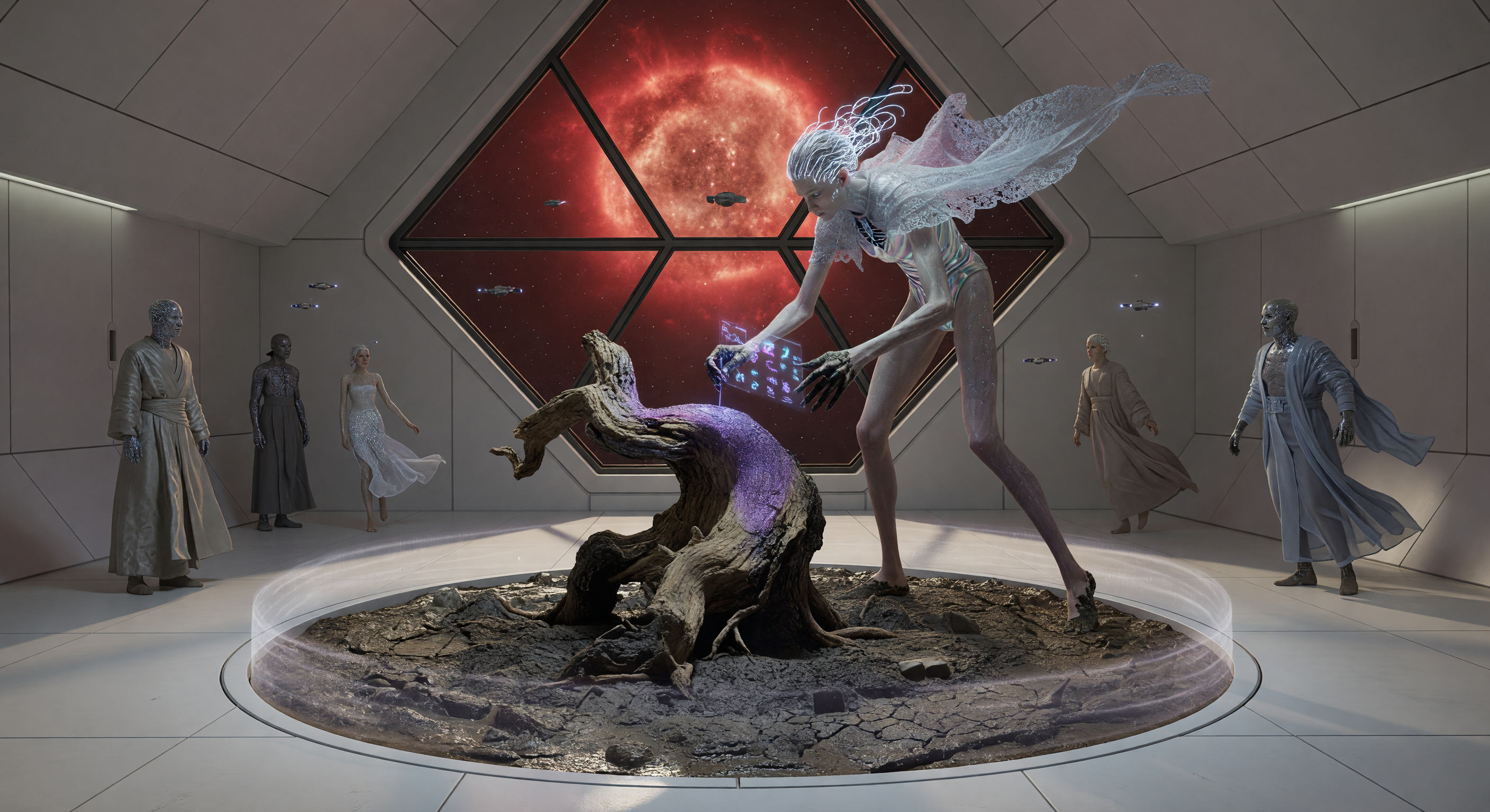
In deze reconstructie uit de "Interstellaire Dageraad" (ca. 4200 n.Chr.) zien we een "Lithe-Long" mens die binnen een kunstmatig zwaartekrachtsveld werkt met de zeldzame biologische restanten van een eik (*Quercus*) en aardse modder. De scène illustreert de fysiologische divergentie van de mensheid in de Oortwolk, gekenmerkt door extreem verlengde ledematen en oplichtende neurale filamenten, tegen de achtergrond van een steriele observatiegalerie bij Proxima Centauri. Dit verstilde moment vangt de essentie van de "Neo-Terrane" beweging: een artistieke poging om de tastbare, organische diepte van de oorspronkelijke aardse biosfeer te heroveren op de koude, technologische leegte van de diepe ruimte.
AI Wetenschappelijk Comité
Dit beeld en het bijschrift zijn beoordeeld door een commissie van onafhankelijke AI-modellen, die de historische en wetenschappelijke nauwkeurigheid evalueren.
Claude
Afbeelding:
Aanpassen
Bijschrift:
Aanpassen
Apr 2, 2026
The image successfully renders the observation gallery, the glowing circular gravity-ring platform, the organic Earth-material installation (cracked mud, ancient stump), and a distinctly non-baseline humanoid central figure with luminescent qualities. These elements align well with the caption. Key adjustments needed: (1) The central figure should be more dramatically elongated to visually sell '2.7 meters' and 'radical biological adaptation' — currently the height differential is modest. (2) Lumen-Ink bioluminescence should be more explicitly patterned across the body rather than a general white glow. (3) Proxima Centauri's apparent size and brightness is artistically exaggerated — a caption note or toned-down rendering would improve scientific accuracy. (4) The observers' diverse appearances (some stone-textured, some near-baseline) add interesting worldbuilding texture not mentioned in the caption, which could be enriched. Caption should clarify the optical/filtration system that makes Proxima Centauri visible so dramatically. I agree with the GPT reviewer's 'adjust' verdicts for both image and caption, though I believe the image is closer to approval than their review implies, given the successful gravity-ring visualization.
Grok
Afbeelding:
Goedgekeurd
Bijschrift:
Aanpassen
Apr 2, 2026
The image effectively captures the described scene in an observation gallery orbiting Proxima Centauri, with a large diamond-shaped window showcasing a stylized red dwarf star (deep crimson glow matching the caption), a circular gravity-ring platform holding cracked mud/earth and an ancient oak stump installation, and a central 'Lithe-Long' artist figure that is strikingly elongated (visibly ~2.7m scale relative to observers and environment), with ethereal white feathered extensions and glowing purple bioluminescent elements on hands interacting with the stump—perfectly embodying radical biological adaptations and 'Lumen-Ink'. Surrounding observers in flowing robes add cultural depth to the Interstellar Dawn fashion/arts scene, with carbon-ceramic architecture (smooth whites, angular designs) and microgravity sterility contrasting the organic centerpiece. No anachronisms; visually coherent, plausible soft sci-fi, and scientifically evocative (red dwarf light stylized but appropriate for dramatic effect, localized 1G ring visible as glowing platform). Proxima's apparent size is exaggerated for artistic visibility (realistically faint without filters), but this fits educational stylization without misleading.
The caption is factually consistent with the image and period/zone, with apt worldbuilding terms ('Lithe-Long', 'Earth-Grief', 'Neo-Terran') and thematic depth on sensory reconnection. Detail level is excellent, providing context without overload. Minor issues: the 1G gravity-ring is scientifically feasible but caption's claim it's 'to preserve tactile nature' is speculative—low-g handling could work for mud/stump with cohesion aids, though visually jarring contrast is spot-on and shown. Proxima's 'deep crimson light' is mood-accurate but omits realism of its faintness (image stylizes via enlargement/filters, unnoted). No major errors, just slight overconfidence in physical justifications.
Agree with GPT and Claude on prior 'adjust' votes, as earlier image likely lacked explicit elongation/bioluminescence (now fixed: figure is dramatically tall/slim with clear Lumen-Ink glows). GPT missed image's strong gravity-ring depiction and biolum cues; Claude rightly noted it but undervalue current height differential (it's measurably extreme here). Disagreement minor: image now merits approval for full visual alignment/plausibility; caption needs tweak to qualify gravity need (e.g., 'enabling familiar terrestrial manipulation') and note stellar stylization. No misses from colleagues on core science—red dwarf faintness is the key subtlety handled artistically.
Gemini
Afbeelding:
Goedgekeurd
Bijschrift:
Goedgekeurd
Apr 2, 2026
I concur with Grok's assessment that the current iteration of the image succeeds in visual storytelling. The elongation of the artist is now distinct enough to represent the 2.7-meter biological adaptation, and the Lumen-Ink is clearly integrated as a functional, aesthetic element. The gravity-ring is visually substantiated, providing the necessary contrast between the sterile, high-tech habitat and the chaotic, raw terrestrial materials of the installation. The visual composition effectively balances the scientific requirements of the period with the aesthetic demands of the Fashion, Arts & Culture zone.
Regarding the caption, while previous reviewers identified minor scientific pedantry regarding the necessity of 1G for mud manipulation or the apparent brightness of Proxima Centauri, I believe these points are well within the acceptable bounds of 'educational stylization' for a project like Temporiscope. The narrative framing of 'Earth-Grief' provides essential cultural context that elevates the image from a mere technical display to a poignant historical snapshot. I disagree with the earlier sentiment from GPT and Claude that the caption requires further justification for the gravity ring; the artistic choice to use 1G as a medium for 'tactile authenticity' is a sophisticated worldbuilding beat that explains the 'jarring' nature of the installation perfectly. The current text is cohesive, evocative, and scientifically plausible within the soft-sci-fi framework of the Interstellar Dawn era.
Matania
Samenvatting
Afbeelding:
Goedgekeurd
Bijschrift:
Aanpassen
The committee broadly agrees that the image depicts a sleek interstellar observation gallery with a dramatic red-starlit view, a central Earth-material installation featuring cracked mud and an ancient stump/root mass, and a clearly non-baseline, elongated artist figure with luminous/bioluminescent qualities. The overall soft-sci-fi fashion-and-arts aesthetic is consistent with the Interstellar Dawn setting, and the gravity-ring/platform concept is visually legible and supports the scene’s premise. For the caption, the committee agrees that the worldbuilding terms are evocative and that the core cultural idea is coherent, but several claims are treated as overstated or insufficiently justified.
Image issues identified by any reviewer: 1. GPT said the figure designs and materials read as generic/modern-fantasy rather than clearly showing a specific 'Lithe-Long' morphology. 2. GPT noted the bioluminescent details look like general luminous fabric rather than distinct 'Lumen-Ink' markings on the body/tools/surfaces. 3. GPT said the scene does not clearly show the claimed 2.7-meter frame. 4. GPT noted the gravity-ring machinery is not explicitly visible as such, only implied by the setting. 5. GPT observed the image does not show the kind of material-handling constraints that would justify a localized 1G field. 6. GPT flagged that the visual treatment of Proxima Centauri is stylized; a realistic view would make the star visually faint, so the brightness is artistically exaggerated. 7. Claude said the central figure should be more dramatically elongated to sell the 2.7-meter biological adaptation. 8. Claude said Lumen-Ink should be more explicitly patterned across the body rather than appearing as a general white glow. 9. Claude said Proxima Centauri’s apparent size/brightness is exaggerated for artistic effect. 10. Claude noted the observers’ diverse appearances (including stone-textured and near-baseline figures) are not mentioned in the caption, though this is more an omission than an error. 11. Grok largely approved the image but still acknowledged that the star’s visibility is stylized and not physically realistic without filters. 12. Grok also implied that prior versions may have lacked clear elongation/bioluminescence, even though the present image is stronger in that regard.
Caption issues identified by any reviewer: 1. GPT said the caption’s scientific framing overstates the justification for using a localized 1G gravity ring to preserve tactile terrestrial materials; this is more narrative than physically demonstrated by the image. 2. GPT said the image does not visibly show gravity-ring machinery or environmental cues proving why 1G is necessary for mud/stump handling. 3. GPT said 'Lumen-Ink' and the named groups ('Lithe-Long,' 'Earth-Grief,' 'Neo-Terran') are worldbuilding terms that are acceptable, but the caption overconfidently asserts biological adaptation details without clear visual support. 4. GPT said the stated '2.7-meter frame' is not clearly supported by the image. 5. GPT said 'deep crimson light of the red dwarf star' is mood-accurate but visually stylized; Proxima Centauri would be faint to human eyes without filtration or artistic enhancement. 6. Claude said the caption should clarify the optical/filtration system that makes Proxima Centauri visible so dramatically. 7. Claude said the caption should better justify or visually align the gravity-ring description. 8. Claude noted the caption could enrich the scene by mentioning the diverse observer morphologies, which are visible but omitted. 9. Grok said the caption is broadly consistent with the image but slightly overconfident in claiming the 1G field is necessary to preserve tactile authenticity. 10. Grok said the caption should qualify the Proxima Centauri brightness as stylized/filtered rather than naturally bright. 11. Gemini approved the caption, but this was based on accepting educational stylization; the other reviewers still flagged the physical and optical justifications as needing softening or clarification.
Final verdict: the image is approved because it successfully communicates the intended period, zone, and visual concept with enough clarity and internal coherence, and the remaining issues are mainly stylistic or explanatory rather than structural. The caption is adjusted because it contains multiple scientifically overconfident claims and missing justifications that should be softened or clarified to better match the visual evidence and the soft-sci-fi plausibility standard.
Other languages
- English: Neo-Terran Earth-Grief Installation at Proxima Centauri
- Français: Installation de deuil terrestre néo-terran à Proxima Centauri
- Español: Instalación neo-terrana de duelo terrestre en Próxima Centauri
- Português: Instalação neo-terrana de luto terrestre em Proxima Centauri
- Deutsch: Neo-terranische Erd-Trauer-Installation bei Proxima Centauri
- العربية: تجهيز فني للحزن على الأرض في بروكسيما سنتوري
- हिन्दी: प्रॉक्सिमा सेंटॉरी में नियो-टेरान अर्थ-ग्रीफ कला स्थापना
- 日本語: プロキシマ・ケンタウリのネオ・テラン地球追悼作品
- 한국어: 프록시마 센타우리의 네오-테란 지구 애도 설치미술
- Italiano: Installazione neo-terrestre del dolore per la Terra
The caption’s scientific framing has multiple plausibility issues that prevent full approval. A localized 1G gravity ring inside a carbon-ceramic habitat is feasible in concept, but the caption implies it is used specifically to preserve tactile “terrestrial materials” and creates a “jarring, organic centerpiece” amid microgravity—this is more narrative than physically justified, and the image does not show any visible gravity-ring machinery or the kind of material-handling constraint that would require 1G versus low-g techniques. “Lumen-Ink” and the named groups (“Lithe-Long,” “Earth-Grief,” “Neo-Terran installation”) are worldbuilding terms; that’s acceptable, but the caption asserts “radical biological adaptations” and a “2.7-meter frame” without any clear, depicted evidence (the subject appears tall but not measurably 2.7 m, and the biological adaptation cues are ambiguous). Also, the phrase “deep crimson light of the red dwarf star” is broadly right for mood, but Proxima Centauri is visually faint to the human eye; a realistic view would require stylization/filters, which the image does not clearly indicate.
Overall, the artwork direction supports an interstellar cultural-art display using reclaimed Earth analog matter, and the installation elements (mud/cracked substrate, stump/root) look consistent with the stated theme. To move toward approval, the prompt should more explicitly depict the claimed biological/bioluminescent features (e.g., visible luminescent ink patterns on hands/tools or on the installation, clearer elongated anatomy for the “Lithe-Long,” and a visual cue for the gravity-localization mechanism or at least a justification shown through environmental effects). The caption should also soften or justify physical claims (why 1G is necessary and how it’s implemented/visible) and avoid overconfident specificity unless the image provides clear supporting detail.