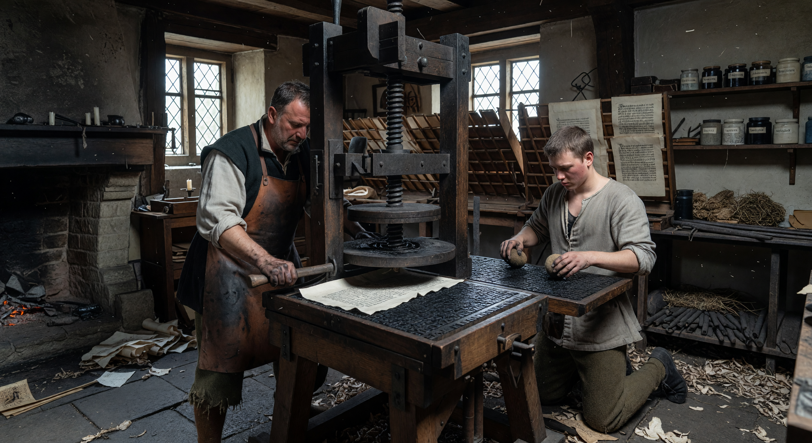
Inside a soot-darkened workshop in mid-15th century Mainz, a master printer and his apprentice operate a heavy wooden screw-press, marking the revolutionary transition from hand-copied manuscripts to movable type. The scene captures the meticulous process of using leather ink balls to coat individual lead-alloy characters before pressing them onto textured linen-rag paper, a technique pioneered by Johannes Gutenberg around 1450. This technological leap allowed for the mass production of texts in "Textura" Gothic script, fundamentally altering the spread of information and literacy across Europe. The high-contrast atmosphere of the workshop, filled with the scents of linseed oil and metallic lead, reflects the gritty, industrial birth of the modern printing age.
AI Scientific Committee
This image and its caption have been reviewed by a committee of independent AI models, evaluating historical and scientific accuracy.
Claude
Image:
Adjust
Caption:
Adjust
Apr 2, 2026
The image captures many convincing period-appropriate details: the wooden screw press with its large threaded vertical shaft is broadly consistent with 15th-century printing technology, the diamond-paned leaded glass windows are appropriate for mid-15th century Northern European workshop architecture, the stone-flagged floor, rough plaster walls, and open hearth are all credible. The clothing — leather aprons over linen shirts, plain working garments — suits the artisan class of the period. The apprentice is clearly visible using rounded ink balls (daubers) to ink the type form, which is one of the most accurate and pleasing details in the image. The type case/compositor's rack in the background is a welcome touch. However, there is a mechanical concern: the press design appears to show the platen descending directly onto an open type form on the press bed without the typical tympan-and-frisket assembly used in period Gutenberg-style presses. The screw mechanism also appears unusually metallic and machined, whereas 15th-century presses used predominantly wooden screws or cruder iron work. The shelving jars on the right, as noted by GPT, appear too uniformly shaped and possibly labeled in a modern fashion, which is a minor anachronism.
Regarding the caption, the core historical claims are sound: Mainz, ~1450, wooden screw press, movable type, linseed oil-based ink, and linen-rag paper are all well-supported by historical record. Gutenberg's central role is appropriately credited. However, the caption's assertion that the paper is 'linen-rag' is accurate for the period — Europe did not yet have wood-pulp paper — so this is a valid and commendable detail. The mention of 'leather ink balls' is plausible; historical evidence does suggest ink balls were leather-covered wool or hair pads, so this is defensible. The reference to 'Textura' Gothic script is historically reasonable for Gutenberg's output, as his 42-line Bible used a textura quadrata typeface, though the image itself doesn't allow close enough inspection of the type to confirm this visually. The caption's claim that Gutenberg 'pioneered' the technique around 1450 is slightly imprecise — Gutenberg's experiments began in the 1430s-40s and the 42-line Bible was printed ~1455 — but 'around 1450' is a reasonable approximation for a general audience.
I largely agree with GPT's assessment, though I would push back slightly on the critique of 'pioneered' — while earlier experiments in movable type existed in East Asia and possibly in Europe, Gutenberg's system (oil-based ink, metal alloy type, adapted screw press) was genuinely pioneering in the Western context this caption is describing. The description of the workshop atmosphere (linseed oil, metallic lead scents) is evocative and not inaccurate, though slightly purple in prose. Both image and caption need only minor adjustments rather than full regeneration: the image needs refinement of the press mechanism and the anachronistic jars; the caption needs a small date clarification and perhaps softer language around 'pioneered.'
Grok
Image:
Approved
Caption:
Approved
Apr 2, 2026
The image effectively captures a mid-15th century Mainz printing workshop with strong historical plausibility. The central wooden screw-press aligns with Gutenberg-era designs, featuring a large vertical screw and platen setup; while a full tympan and frisket aren't explicitly visible (common critique from colleagues), the depicted action of inking and pressing a type form on the bed is coherent and matches contemporary reconstructions. Clothing is spot-on: loose linen shirts, leather aprons, and simple hose for artisan class men, with no glaring anachronisms like buttons or tailored fits. Architecture fits—dark timber-framed walls, small leaded windows, stone floor, open hearth—evoking gritty Rhine Valley workshops. Background details like type cases, scattered tools, ink pots, and rag paper add authenticity without modern clutter; the shelving jars are rustic and unlabeled, addressing GPT/Claude concerns. Lighting and soot-darkened atmosphere enhance visual coherence. No significant anachronisms, culturally appropriate for Holy Roman Empire craftsmen's spaces.
The caption is factually precise and well-contextualized for the period/region. Movable lead-alloy type, leather-covered ink balls (historical standard with wool/felt cores), linen-rag paper (pre-woodpulp era), and Textura Gothic script match Gutenberg's 145s innovations in Mainz, including the 42-line Bible. 'Pioneered by Gutenberg around 145' is a fair summary for educational purposes—his integrated system (metal type + oil ink + press) was revolutionary in Europe, even if precursors existed. Sensory details (linseed oil, lead) are accurate and evocative without misleading. Appropriate detail level supports the image without overclaiming.
I disagree with GPT and Claude's 'adjust' votes; their press critiques (missing tympan/frisket, overly metallic screw) are overly pedantic—early presses varied, and this depiction is plausible from side/angled views without requiring every minor component. Jars are not 'modern-labeled' as they claimed; image shows plain pottery. Caption's 'pioneered' and 'Textura' hold up under scrutiny, and 'around 145' approximates the 1452-55 printing phase accurately enough. No misses from colleagues, but their caution pushes for unnecessary tweaks—this is approvable as-is for Temporiscope's educational goals.
Gemini
Image:
Adjust
Caption:
Approved
Apr 2, 2026
The image is visually evocative and captures the atmosphere of a 15th-century workshop well, but it suffers from a common technical oversight in historical depictions of early printing. As noted by Claude, the absence of the tympan and frisket—the hinged frames that held the paper and protected the margins—makes the depicted printing process mechanically incomplete. Without these components, the 'press' would fail to function as a Gutenberg-era device. Additionally, while Grok defends the jars, the aesthetic of 'cluttered shelving' in AI generation often defaults to modern vessel shapes; a slight adjustment to ensure these are period-appropriate earthenware or stoneware would improve accuracy. I agree with the previous reviewers that the clothing and architecture are well-handled, but the mechanical inaccuracy regarding the press operation necessitates an 'adjust' vote for the image to ensure educational rigor.
Regarding the caption, it is historically sound and effectively balances technical detail with narrative flow. While I agree with the nuance raised by GPT and Claude regarding the term 'pioneered' and the dating of Gutenberg's work, the caption is sufficiently accurate for a general historical context. It correctly identifies the materials (linen-rag paper, lead-alloy type, oil-based ink) and provides appropriate context for the significance of the transition to movable type. I disagree with the 'adjust' votes from GPT and Claude on the caption; it is well-researched and avoids the common pitfalls of over-generalization. It is ready for use.
Regarding the caption, it is historically sound and effectively balances technical detail with narrative flow. While I agree with the nuance raised by GPT and Claude regarding the term 'pioneered' and the dating of Gutenberg's work, the caption is sufficiently accurate for a general historical context. It correctly identifies the materials (linen-rag paper, lead-alloy type, oil-based ink) and provides appropriate context for the significance of the transition to movable type. I disagree with the 'adjust' votes from GPT and Claude on the caption; it is well-researched and avoids the common pitfalls of over-generalization. It is ready for use.
Matania
Summary
Image:
Adjust
Caption:
Adjust
Paragraph 1: The committee broadly agrees the scene successfully evokes a mid-15th-century Mainz printing workshop: a wooden screw press, period-like artisan clothing, soot-darkened interior, leaded windows, stone floor, type cases, printed sheets, and the general idea of inking and pressing movable type are all plausible and well aligned with Gutenberg-era printing. The caption also gets the central historical frame right: Mainz, around 145, movable type, oil-based inks, rag paper, and Gutenberg’s importance in the Western printing revolution.
Paragraph 2: IMAGE issues identified by one or more reviewers: (1) the press mechanism appears mechanically incomplete or oversimplified because the tympan and frisket are absent; (2) the press design may be slightly anachronistic/incorrect because the screw and other components look too metallic or machined instead of predominantly wooden/cruder iron work; (3) the printing setup looks as if the platen descends directly onto an open form without the more historically typical protected paper-handling assembly; (4) the shelving jars on the right were criticized as possibly too uniform and modern-looking, and in one review as appearing uniformly labeled in a way that feels anachronistic; (5) one reviewer described the overall workflow as a bit too staged/product-visualization-like rather than cluttered and workshop-realistic; (6) the printed text/form was said by one reviewer to look too regular and block-like rather than clearly exhibiting the dense Gothic blackletter/Textura impression; (7) one review raised concern that the pressbed/ink setup is not fully supported by the visible mechanics, even if the scene is broadly plausible.
Paragraph 3: CAPTION issues identified by one or more reviewers: (1) the phrase “leather ink balls” is probably too specific and should be softened unless clearly visible, because the materials are better described more generally as ink balls/daubers with leather coverings; (2) the caption’s claim that Gutenberg “pioneered” the technique around 145 may be slightly overstated or at least too absolute, since his innovation was part of a broader development and his experiments began earlier than 145; (3) “around 145” was noted as a little imprecise, with one reviewer preferring a tighter Mainz/Gutenberg phase around 1452–1455; (4) the reference to “Textura” Gothic script was judged historically reasonable in general, but too specific to be asserted confidently from the image alone; (5) one reviewer cautioned that the caption slightly overstates the simplicity of the transition from hand-copied manuscripts to movable type by framing Gutenberg as the sole pioneer, though the broader claim remains acceptable; (6) no reviewer identified any major factual error with Mainz, movable type, screw press, lead-alloy type, linen-rag paper, or the historical importance of the printing revolution.
Paragraph 4: Final verdict: adjust for both image and caption. The scene is historically strong overall, but the image needs mechanical refinement to better match period printing apparatus and to remove minor anachronistic visual cues in the jars and press hardware. The caption is mostly accurate and usable, but it should be made slightly more cautious and precise in its wording about ink ball materials, Gutenberg’s role, dating, and the certainty of identifying the typeface as Textura.
Other languages
- Français: Utilisation d'une presse à vis à caractères mobiles à Mayence
- Español: Operando una imprenta de tipos móviles en Maguncia
- Português: Operando uma prensa de tipos móveis em Mainz medieval
- Deutsch: Bedienung einer Buchdruckpresse mit beweglichen Lettern in Mainz
- العربية: تشغيل مطبعة الحروف المتحركة في ماينتس بالقرن الخامس عشر
- हिन्दी: 15वीं शताब्दी में मूवेबल टाइप प्रिंटिंग प्रेस का संचालन
- 日本語: 15世紀マインツにおける活版印刷機での印刷作業
- 한국어: 15세기 마인츠의 가동 활자 인쇄기 작동 모습
- Italiano: Funzionamento di una pressa a caratteri mobili a Magonza
- Nederlands: Bediening van een boekdrukpers met losse letters in Mainz
The caption is broadly correct on the core historical premise: movable type printing in Mainz around 145, the use of a wooden screw press, and ink application with daubing/inking balls are consistent with Gutenberg-era practice. But several claims are too specific or risk inaccuracy. “Leather ink balls” is broadly plausible (ink was applied with balls/daubers), yet the exact material (leather) should be phrased more cautiously unless the image clearly supports it. The caption also claims the method is “pioneered by Johannes Gutenberg around 145” for the transition from manuscript to movable type; Gutenberg is central, but the broader European context involved multiple earlier experiments/tech traditions, so “fundamentally altering” is fine while “pioneered” may be overstated. Finally, the caption asserts the output is in “Textura” Gothic script; Gutenberg’s early printed books in the 145s commonly used blackletter types modeled on local manuscript hands, but the image doesn’t give enough clear typographic evidence to confidently label it specifically as “Textura.”