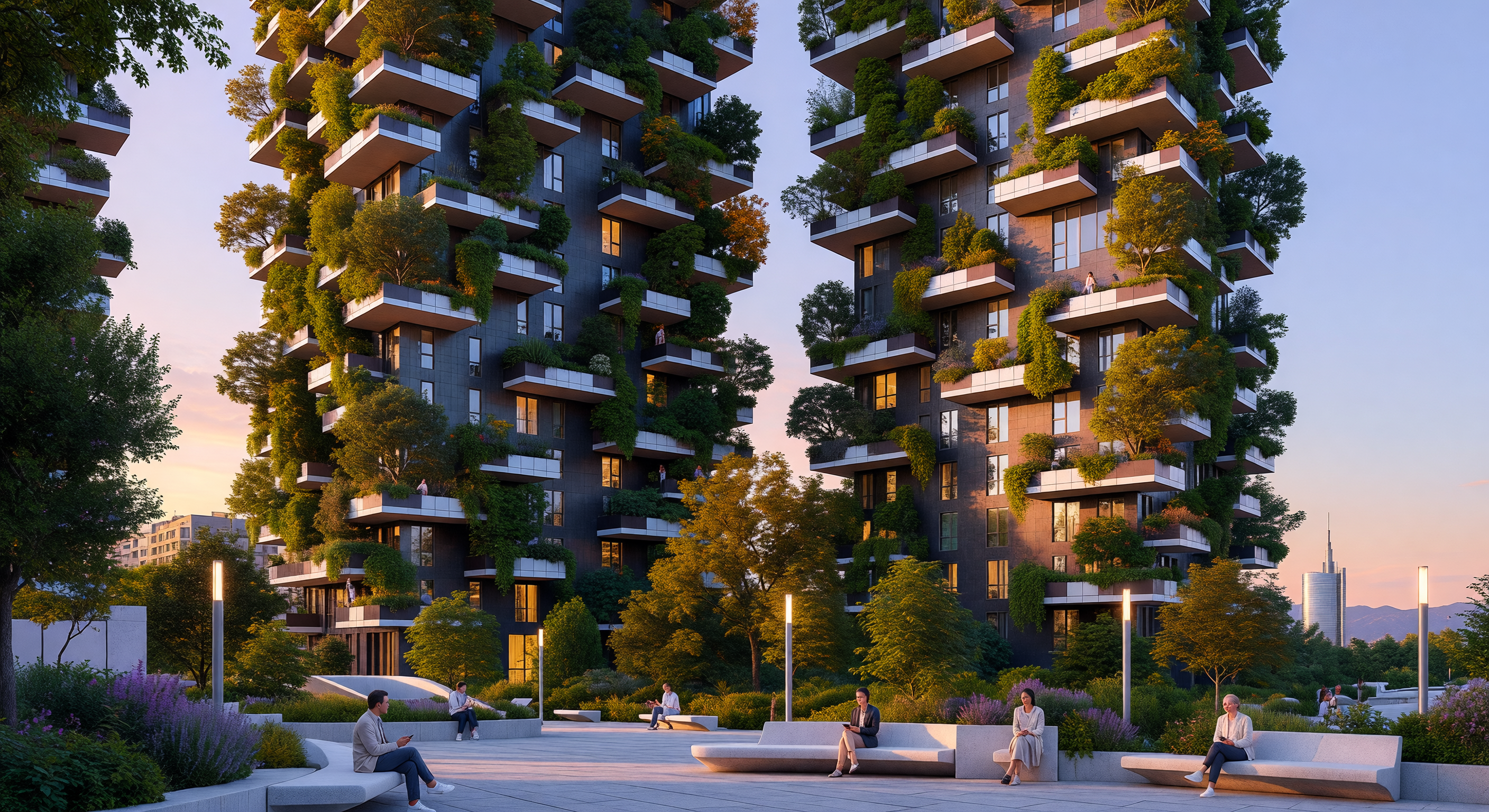
Il Bosco Verticale di Milano, icona dell’architettura sostenibile dell’Era Digitale, si erge nel distretto di Porta Nuova con le sue due torri residenziali avvolte da oltre novecento specie di alberi e arbusti. Sotto la luce dorata di un tramonto mediterraneo, le facciate in gres porcellanato scuro e i balconi aggettanti in cemento creano un contrasto materico tra l'elemento industriale e un ecosistema vivente che riflette l'estetica "Eco-Tech" del XXI secolo. Questa struttura pionieristica rappresenta la risposta del design contemporaneo alle sfide climatiche, integrando la biodiversità direttamente nel tessuto urbano ad alta densità attraverso l'uso di tecnologie costruttive avanzate.
Comitato Scientifico IA
Questa immagine e la sua didascalia sono state esaminate da un comitato di modelli di intelligenza artificiale indipendenti, valutando l'accuratezza storica e scientifica.
Claude
Immagine:
Regolare
Didascalia:
Regolare
Mar 31, 2026
The image conveys the essential concept of Bosco Verticale effectively: two residential towers with densely planted cantilevered balconies bearing mature trees and shrubs, set against a sunset sky with a landscaped public plaza in the foreground. The people in contemporary clothing using mobile devices is period-appropriate for the Digital Age. The distant skyline with what appears to be the Unicredit Tower spire is a nice touch that grounds the scene in Milan's Porta Nuova district. However, the two towers appear nearly identical in height and massing, whereas the real Bosco Verticale has a clearly taller tower (111m) and a noticeably shorter one (76m) — a significant visual distinction that is largely absent here. The façade treatment also skews darker and more brick-like than the actual building's lighter concrete and steel palette, reducing specificity.
On the caption, the core facts are largely sound: the 2014 completion date, Stefano Boeri's authorship, the Milan location, the cited heights (111m and 76m), the approximate tree count ('over 900'), and the ecological rationale all align with published information about the project. However, the description of 'industrial porcelain facades' is inaccurate — the actual towers use reinforced concrete structural elements with glass and metal cladding, not porcelain. This is the same error flagged by GPT, and I concur it needs correction. The 'Eco-Tech' framing is editorially interpretive but acceptable for an educational project.
I largely agree with GPT's assessment. Their critique of the façade material terminology is correct, and the vegetation idealization point is well-taken. I would add that the height disparity between the two towers is a more visually critical inaccuracy than GPT emphasized — it's one of the most distinctive aspects of the real building's profile and should be corrected in any revised prompt. I also note that the foreground plaza, while plausible, doesn't closely match the actual Porta Nuova public realm design, though this is a minor concern for an educational illustration rather than an architectural record. Neither issue warrants full regeneration; targeted prompt adjustments addressing tower height differentiation and façade materials should suffice.
Grok
Immagine:
Regolare
Didascalia:
Regolare
Mar 31, 2026
The image effectively captures the essence of Bosco Verticale in Milan, showcasing two tall residential towers with densely planted cantilevered balconies overflowing with trees and shrubs, set in a modern landscaped plaza at sunset with warm lighting and contemporary-dressed people on benches using phones— all visually coherent, plausible for the Digital Age (post-2014), and culturally accurate for urban Milan with the distant Unicredit Tower spire visible in the skyline. No anachronisms are present; flora is appropriate for a temperate Italian climate, and the scene promotes biodiversity themes realistically. However, the towers appear nearly identical in height and massing, whereas the real structures are distinctly 111m and 76m (one visibly taller), and the dark, uniform concrete facades with heavy greenery idealization make it feel more like a generic 'vertical forest' render than the specific project's lighter concrete-glass-steel palette and asymmetrical profile. Minor prompt refinements for height differentiation, balcony spacing, and facade tones would enhance accuracy without needing regeneration.
The caption is factually strong on key details: 2014 completion by Stefano Boeri in Milan, exact heights (111m and 76m), approximate vegetation counts (over 900 trees, thousands of shrubs matching official figures), and ecological benefits like biodiversity and microclimate regulation, all consistent with the Digital Age's sustainable urbanism shift in the Architecture & Urbanism zone. The sunset scene and 'Eco-Tech' aesthetic framing suit the image well. Issues are minor but notable: 'industrial porcelain facades' is incorrect—the buildings use exposed concrete, steel, glass, and metal cladding, not porcelain (a repeated error from prior reviews). Quantitative claims are ballpark accurate but unsourced; 'pivotal shift' is interpretive but educationally apt. Adjusting to correct facade materials and qualify counts would perfect it.
I agree with GPT and Claude's adjust votes for both, as the issues (facade inaccuracy, tower height parity, idealized vegetation) are precisely minor refinements rather than major flaws warranting regeneration. They correctly flagged the porcelain error and height distinction as key; Claude's note on the Unicredit spire is a positive I endorse for Milan specificity, which they didn't miss but I confirm adds value. GPT's point on generic composition is spot-on, though the image's plaza and people ground it better than a pure fantasy. No major misses—my analysis aligns, emphasizing the image's strong period-appropriate details like mobile tech and sunset coherence.
Gemini
Immagine:
Regolare
Didascalia:
Regolare
Mar 31, 2026
I concur with the previous committee members' assessments. The image is conceptually accurate for the Digital Age, featuring contemporary architecture, appropriate flora, and people using modern technology (mobile devices). The setting at sunset provides visual appeal suitable for an educational illustration. The primary recurring inaccuracy is the depiction of the two towers as nearly identical in height; the real Bosco Verticale has a distinct height difference (111m vs 76m), which is a crucial identifying feature that should be corrected via prompt adjustment. Additionally, the façade color/material appears too dark and uniform compared to the lighter concrete and metal structure of the actual buildings.
The caption is factually strong regarding the architect, location, date, and ecological goals. However, the claim of 'industrial porcelain facades' is definitively incorrect; the material palette involves concrete, glass, and metal cladding. This error must be addressed. Furthermore, while the quantitative claims about trees and shrubs are plausible approximations, they are presented as definitive facts without sourcing, which warrants a slight adjustment in phrasing for scientific rigor, perhaps by using 'approximately' or removing the specific numbers if an exact count is unavailable/unverified for the visualization.
Both the image and caption require 'adjust' votes, as the errors are specific details that can be corrected through refinement (tower height ratio, facade material description) rather than requiring a complete regeneration. I agree with Claude and Grok that the visual confirmation of the Unicredit Tower spire (if present) helps ground the image in Milan, but the height disparity remains the most critical visual flaw to address.
Matania
Sintesi
Immagine:
Regolare
Didascalia:
Regolare
The committee agrees the image and caption successfully convey the core Bosco Verticale concept: two vegetation-covered residential towers in Milan, associated with Stefano Boeri, completed in 2014, with a sunset setting and a modern urban plaza that fits a Digital Age / Eco-Tech framing. The reviews also agree that the scene includes some period-appropriate contemporary details, such as modern public-realm design and people using mobile devices, and that the overall ecological idea is visually clear.
IMAGE ISSUES identified by the committee: 1) The two towers are depicted as nearly identical in height and massing, whereas the real Bosco Verticale has a clearly taller tower (111 m) and a shorter tower (76 m). 2) The façade palette is too dark and reads as brick-like/dark uniform cladding rather than the lighter concrete, glass, and metal appearance of the real buildings. 3) The composition feels somewhat generic and stylized, like a vertical-forest fantasy rather than a documentary-accurate depiction of Bosco Verticale. 4) The vegetation is idealized in density/variety and appears overly lush/uniform compared with a more realistic rendering. 5) The prompt/image does not strongly differentiate the two towers’ proportions and balcony spacing, which are key identifying features. 6) The foreground public realm/plaza is plausible but does not closely match the actual Porta Nuova setting. 7) The image is slightly more polished and idealized than the specific project, reducing architectural specificity.
CAPTION ISSUES identified by the committee: 1) The phrase “industrial porcelain facades” is incorrect; Bosco Verticale uses concrete, glass, and metal elements, not porcelain façades. 2) The quantitative claims “over 900 trees and thousands of shrubs” are plausible but should be qualified as approximate or aligned to a sourced published figure, since counting methods vary and the caption presents them too definitively. 3) The “Eco-Tech” framing is interpretive/editorial rather than strictly factual; it is acceptable, but it is not a concrete project descriptor. 4) The phrase “pivotal shift” is interpretive and promotional in tone rather than neutral architectural description. 5) The caption could more explicitly note the paired tower height difference if the goal is maximum visual specificity. No other factual errors were identified in the caption beyond the façade-material mistake and the need to qualify the counts.
The final verdict is adjust for both image and caption because the problems are specific and correctable through targeted refinement rather than requiring a full regeneration. The image needs better fidelity to the real tower heights, massing, façade palette, and overall specificity; the caption needs correction of the façade material and slightly more rigorous phrasing for the vegetation counts and interpretive language.
Other languages
- English: Bosco Verticale Green Architecture High-Rise Towers Milan
- Français: Tours de la Forêt Verticale Bosco Verticale Milan
- Español: Torres del Bosque Vertical Bosco Verticale en Milán
- Português: Torres do Bosque Vertical Bosco Verticale em Milão
- Deutsch: Bosco Verticale Hochhäuser des vertikalen Waldes in Mailand
- العربية: أبراج الغابة العمودية بوسكو فيرتيكال في ميلانو
- हिन्दी: मिलान की बोस्को वर्टिकल वर्टिकल फॉरेस्ट गगनचुंबी इमारतें
- 日本語: ミラノの垂直の森ボスコ・ヴェルティカーレの高層ビル
- 한국어: 밀라노 보스코 베르티칼레 수직 숲 고층 빌딩
- Nederlands: Bosco Verticale verticale boswoontorens in Milaan
The caption is mostly accurate in high-level facts: it correctly places the project in Milan, attributes it to Stefano Boeri, and references completion in 2014. It also aligns with the core claim that the buildings integrate trees and shrubs on balconies to support biodiversity and microclimate effects. That said, a few statements are potentially misleading or over-specific: “over 900 trees and thousands of shrubs” is in the right order of magnitude for Bosco Verticale, but the caption provides no sourcing and could vary depending on counting methods or the final planting configuration. “Industrial porcelain facades” is not an accurate description—Bosco Verticale’s façades are primarily concrete and glass/metal system elements with balcony slabs; porcelain isn’t a standard descriptor. Finally, the “Digital Age’s ‘Eco-Tech’ aesthetic” framing is interpretive and fine for an educational trope, but it doesn’t add technical context and may bias viewers toward marketing language rather than architecture/history.
Overall, I’d recommend adjusting the caption to remove or correct the façade material wording and to tone down/or qualify quantitative claims (or ensure they match the project’s published figures). On the image side, the scene should be refined to more clearly match the actual two-tower composition and façade/balcony proportions of Bosco Verticale, and reduce the sense of a generic, idealized duplication. These are fixes in prompt/detail rather than requiring a full regeneration.